For universities, data analytics is the backbone of strategic decision-making in higher education. In 2026, universities that fail to track the right metrics will struggle to compete, to retain students, and to make decisions with confidence. The sheer volume of data that institutions collect is overwhelming: student records, course details, financial transactions, learning activity logs, and admissions inquiries, but raw data on its own doesn’t help anyone. Without systems to turn that data into readable, comparable insight, institutions drown in spreadsheets. They miss trends, overlook early signs of problems, and react too late.
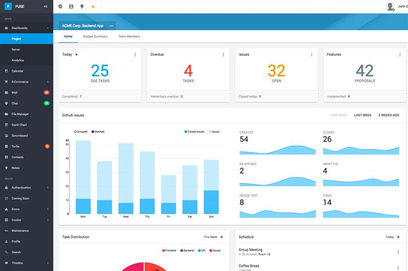
Imagine an admissions team working off isolated files: one spreadsheet for inquiries, another for test scores, yet another for campaign performance. Without a unified view, leaders don’t see which recruitment channels drive quality applicants. They don’t know where in the funnel students are dropping off. Admissions counsellors are left guessing, not guiding. That’s where education dashboards come in. A dashboard unifies disparate data points, updates in real time, and shows patterns at a glance. Instead of delays and guesswork, leaders see live numbers, trends, and alerts that guide action in minutes rather than weeks.
Similarly, academic leaders without analytics often wait until the end of a semester to assess performance. They fix issues long after they have affected students. But data analytics systems today go beyond historical reporting. They make learning analytics visible as it happens, helping faculty and advisors identify at-risk students early and intervene effectively, a practice proven to improve retention when used with real-time engagement and performance data.
Why Raw Data Fails Without Dashboards

Raw data without visualisation is like a library without a catalogue. Universities collect enormous amounts of data through student information systems, learning management systems, finance platforms, and campus apps. These datasets hold insights into academic success, operational efficiency, and student engagement. But raw figures in spreadsheets are hard to interpret and even harder to act on. Decision-makers lose time sifting through rows and columns. Leaders lack real-time visibility, so responses come too late. Manual reporting leads to mismatched versions of the truth across departments. Data that should tell a story ends up hiding one.
Read More: Why Manual Admission Processes Are Costing Universities Time and Money
Dashboards solve this by connecting to institutional systems, integrating various data sources and presenting key metrics in a clear visual form. They transform static figures into evolving narratives. Instead of waiting for quarterly reports, leaders get live views of enrollment trends, course performance, and financial health. Disconnected spreadsheets hide real trends; dashboards surface them. The result is faster, evidence-based decisions that improve student outcomes and institutional performance.
Key Metrics Every University Tracks

In 2026, tracking the right metrics isn’t optional. Universities must monitor data that reveals how well they attract, support, and retain students. Here are key data points institutions should track:
Leads by Source and Campaign
Where do your prospective students come from? Universities must track inquiries and leads by source, social media, referrals, school visits, ads, and by campaign. This shows which recruitment efforts generate quality interest and which waste resources. Without this data, enrollment teams spend money on channels that don’t deliver results.
Admission Stage-Wise Movement
Admissions isn’t a single event. It’s a funnel. Students move from initial inquiry to application, to acceptance, to enrollment. Tracking how many prospects advance, or drop off, at each stage reveals friction points. If a large percentage abandon applications halfway through, the process needs redesigning.
Drop-Off Rates at Each Funnel Step
Closely connected to stage movement is the drop-off rate. Are students quitting online forms? Ignoring interview requests? Data analytics systems show precisely where candidates stop progressing, so teams can fix the process.
Course Progress by Semester
Academic performance analytics should measure more than final grades. Tracking progress across semesters helps identify patterns in learning outcomes. Are certain programs seeing slower advancement? Are specific modules causing difficulty? Early insight enables timely curriculum adjustments.
Attendance and Learner Activity Logs
Student engagement predicts success. Attendance records and learning activity logs from digital platforms show how actively students participate. Low engagement often precedes poor performance. Dashboards help educators see these trends as they develop, not after they become crises.
Fee Collection vs Pending Dues
Financial analytics matter too. Monitoring fee collection against pending dues reveals cash flow issues and helps finance teams trigger reminders or intervention workflows. Incomplete payments can correlate with disengagement and dropout risk if not addressed early.
Together, these metrics give a comprehensive picture of institutional performance from recruitment to graduation.
Read More: How Data Analytics in LMS Platforms Boost Learner Success Rates
Academic Data vs Operations Data

Understanding university analytics requires distinguishing academic data from operational data. Academic data focuses on learning outcomes and student success. It answers questions like: Are students mastering key concepts? Which courses have high failure rates? Academic metrics guide faculty planning, curriculum redesign, and student support strategies. This aligns with what research in higher education analytics emphasises: dashboards help monitor performance levels and engage early intervention where needed.
Operations data, on the other hand, supports recruitment, resource allocation, and institutional planning. It tracks system flow, enrollment volumes, admissions pipeline health, financial status, and administrative efficiency. It helps admissions directors optimise their funnel or finance teams manage revenue.
Both are essential and serve different leadership roles. A unified dashboard allows different university leaders to view relevant slices of the same underlying data, ensuring decisions are coordinated and consistent.
How Vigilearn Products’ Dashboards Help Management
Vigilearn offers a suite of products (EdiifyLMS, Enroli SIS, Apply Portal and Studio) designed to give university leaders clear, actionable analytics on critical metrics.
Single login view for leadership. University executives need a panoramic yet understandable snapshot of performance. Vigilearn dashboards consolidate data from multiple systems, giving leaders a unified view in one login.
Live intake and admission numbers. Admissions teams can view lead sources, campaign effectiveness, and funnel progress in real time. This improves response time and resource allocation.
Program-wise performance tracking. Academic leaders can see semester performance, course completion rates, and trends that help tailor academic support.
Campus-wise comparison reports. Multi-campus universities benefit from comparative analytics. Which campuses perform best? Where do retention challenges arise? Dashboards make comparisons easy.
Student progress visibility on one screen. Advisors and instructors can monitor engagement, attendance, progress, and grades for real-time academic interventions instead of waiting for end-of-term reports.
Turning Reports into Decisions
Data analytics without action is just noise. The true value lies in decision-making.
When data shows low lead quality, marketing teams revise campaigns. If analytics reveal high drop-off at certain application steps, process teams redesign forms or simplify requirements. Weak course progress in a program triggers academic reviews and tailored student support. High fee payment delays lead to automated reminders and personalised outreach. Low conversion rates prompt training for counsellors and refined engagement strategies.
Universities with data-driven cultures don’t wait for trends to become crises. They act early. Analytics systems are not just reporting tools; they shape strategic responses and institutional resilience.
For universities that embrace this approach, data becomes a strategic asset rather than a collection challenge. When data guides decisions, every part of the university works better. And in 2026, that is what separates winners from the rest.
